Improving the way managers control and track VPN licenses
A purchase flow redesign that drove a 17% increase in plan adoption
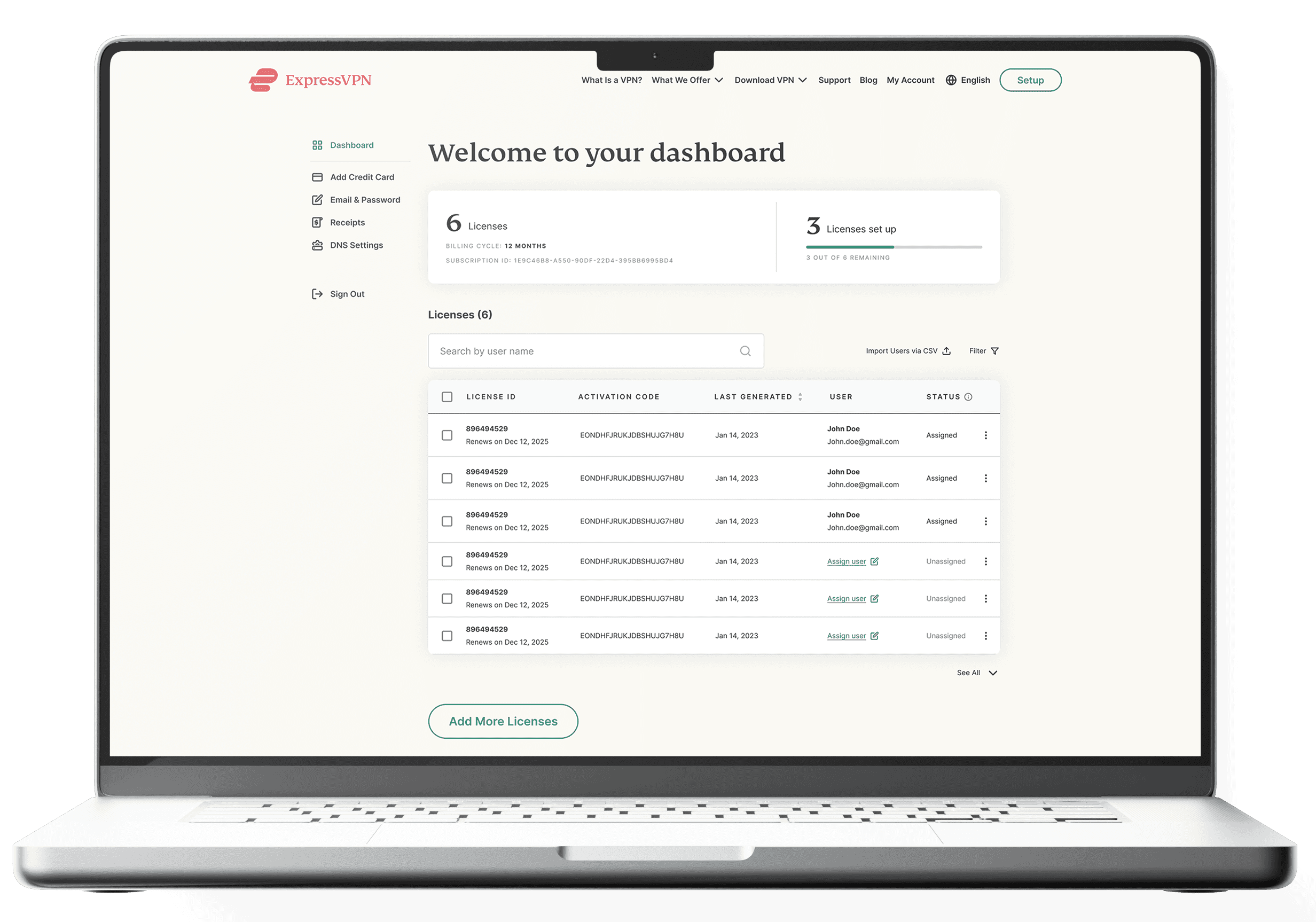
The Business License Manager is an internal ExpressVPN tool that allows managers to purchase and handle VPN licenses for their team - adding users, renewing licenses, and updating permissions, all in one place.
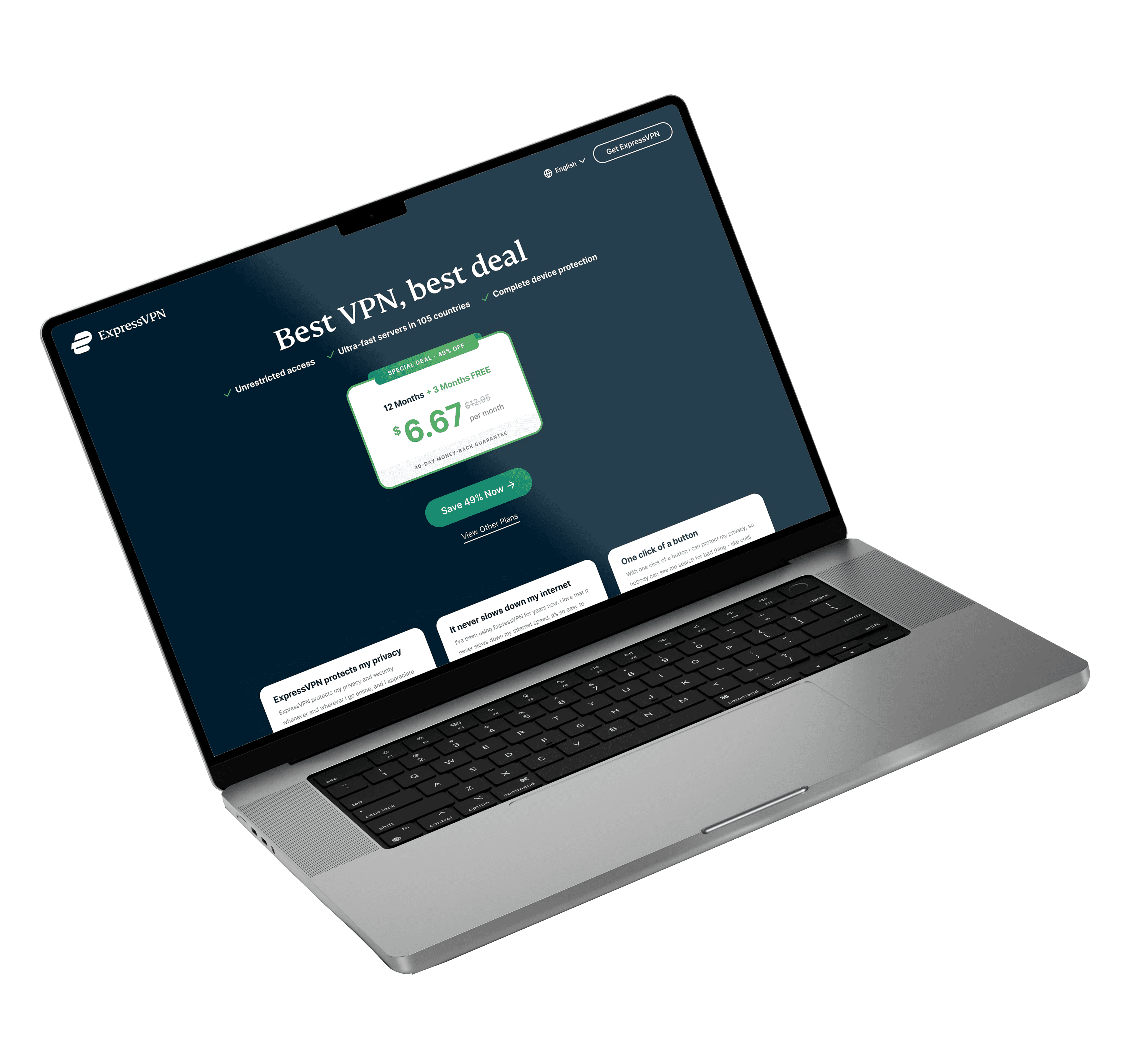
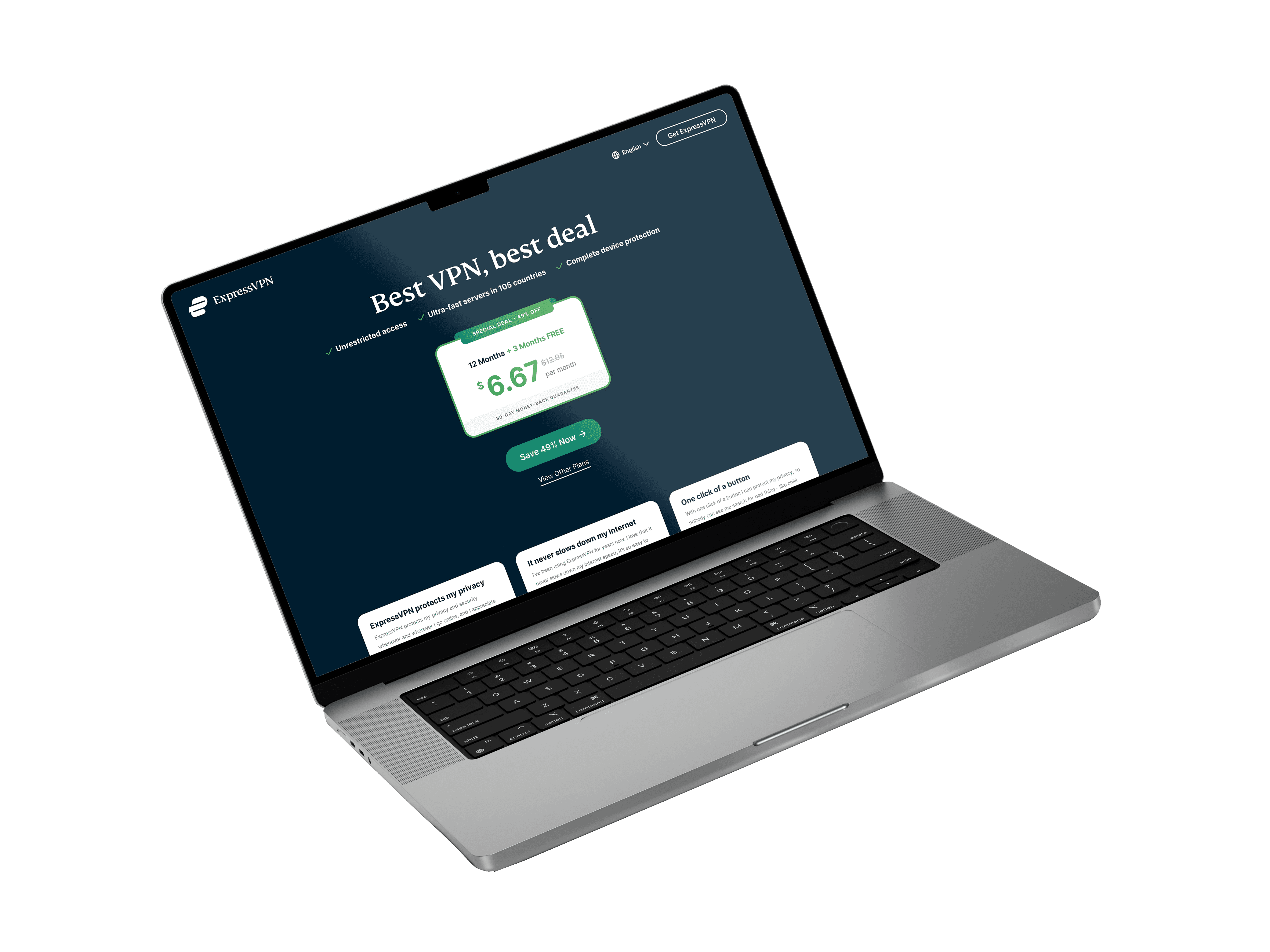
A landing page promoting a special subscription deal was underperforming. Following an A/B test that revealed low conversion rates, I redesigned the page to better emphasize the offer and remove friction from the flow.
Dashboard Redesign
CRO
B2B SaaS
|
ExpressVPN
cro
|
ExpressVPN
A purchase flow redesign that drove a 17% increase in plan adoption
A landing page promoting a special subscription deal was underperforming. Following an A/B test that revealed low conversion rates, I redesigned the page to better emphasize the offer and remove friction from the flow.
Goals:
Simplify the purchase flow & license management experience, increase subscription conversions, and improve user satisfaction.
Increase conversion rate, improve CTR, and guide more users to purchase the best plan.
Key problems:
The existing experience suffered from disconnected flows, unclear purchase steps, poor license visibility, and no tools for managing teams at scale.
The existing design had low conversion rates - driven by a misleading CTA, a disconnect between the promoted offer and the user flow, and too many choices that created decision fatigue."
Role:
UX/UI Designer (alongside 1 Designer, 1 PM & 2 Developers).
UX/UI Designer (alongside 1 Developer).
Timeline:
2-3 Weeks (a few days of discovery, 2 weeks of design & iterations).
1-2 Weeks (A/B test analysis, design, iterations & A/B test).
Results:
The redesign led to measurable improvements across the purchase flow - higher conversions, more engagement, and significantly less drop-off.
The redesigned flow drove measurable improvements - higher engagement, stronger take-rate on the promoted plan and better conversions.
+22%
+12%
CTR
+18%
+17%
Click through rate
Plan adoption rate
-16%
+8%
Drop-off rate
Conversion rate
TL;DR
What I shipped
TL;DR
What I shipped
Goals:
Increase conversion rate, improve CTR, and guide more users to purchase the best plan.
Key problems:
The existing design had low conversion rates - driven by a misleading CTA, a disconnect between the promoted offer and the user flow, and too many choices that created decision fatigue."
Role:
UX/UI Designer (alongside 1 Developer).
Timeline:
1-2 Weeks (A/B test analysis, design, iterations & A/B test).
Results:
The redesigned flow drove measurable improvements - higher engagement, stronger take-rate on the promoted plan and better conversions.
+12%
Click through rate
+17%
Plan adoption rate
+8%
Conversion rate
The problem
Strong offer, misleading flow - users were dropping off before they could convert
An A/B test on the existing landing page revealed that users weren't converting as expected - even though the deal was genuinely compelling. Drop-off rates were high, and the promoted plan wasn't being chosen at the rate the business needed.
The data made one thing clear: the problem wasn't the offer. It was the flow surrounding it.
Two core pain points made this clear:
#01
The CTA didn't lead where the offer pointed
The hero button was the most prominent action on the page - but instead of taking users directly to the best plan checkout, it routed them to a generic plans page. The momentum built by the offer was lost the moment users clicked.
#02
Too many choices slowed decisions
Presenting all plans upfront introduced decision fatigue - pulling users' attention away from the promoted plan and making it harder to commit.
The process
The process
From A/B test findings to redesign
The A/B test results were the starting point - drop-offs were high and the promoted plan wasn't converting as expected. A focused review of the flow helped identify the friction points behind the numbers.
The redesign was built around one guiding principle: if the page promotes one plan, every other element should reinforce that choice. With that defined, the work moved into wireframes, UI design, and iterations, ending with an A/B test that validated the redesign.
A/B Test
Analysis
Flow
Review
Problem
definition
Wireframes &
UI Design
Iterations &
A/B Test
Handoff
Analytics &
tickets review
Heuristic
evaluation
Problem
definition
Wireframes &
UI Design
Iterations &
A/B Test
Handoff
The SOLUTION
A clearer, more direct path to the
promoted offer
challenge #01
Inconsistent message and flow
The page promoted the best plan, but the CTA routed users to a plans page - adding an unnecessary step right when they were ready to act
solution #01
Direct path to the best offer
The primary CTA now leads directly to the 12+3 checkout.
The copy, visual hierarchy, and CTA all reinforce the same message - making the promoted plan feel like the obvious choice.
challenge #01
Too many choices slowed decisions
Presenting all plans upfront pulled attention away from the promoted offer and made it harder for users to commit - creating friction at the most critical point in the flow.
solution #01
Direct path to the best offer
A secondary 'View all plans' button was added for users who want to compare - but visually de-emphasized so it doesn't compete with the main CTA.
Users who do browse all plans are no longer the default path - the primary flow skips this step entirely
The option to view all plans remains available, ensuring users who need more information aren't left without a way to explore.
The SOLUTION
A seamless flow from purchase to license management
A purchase flow that failed to convert
The purchase page didn't clearly show how to complete the purchase or what would happen next, and it didn't highlight the best-value option - so users didn't feel confident or motivated to buy.
challenge #01
A clear purchase flow
Restructured the purchase landing page with a clear hierarchy and logical flow.
Highlighted the best-value option to guide decision-making.
Added prominent call-to-action buttons to reduce hesitation.
The primary CTA now leads directly to the 12+3 checkout.
The copy, visual hierarchy, and CTA all reinforce the same message - making the promoted plan feel like the obvious choice.
The primary CTA now leads directly to the 12+3 checkout.
The copy, visual hierarchy, and CTA all reinforce the same message - making the promoted plan feel like the obvious choice.
solution #01
Disorganized license manager with low visibility
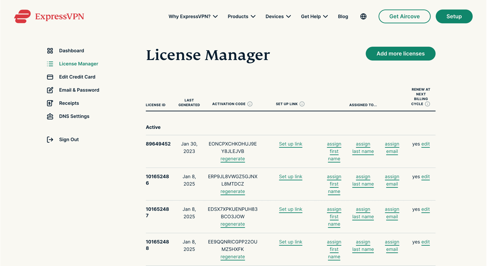
The License Manager didn't provide a clear overview of total, assigned, or remaining licenses. The interface was cluttered with buttons that created confusion, and missing tools like search, filters, and bulk actions made managing large teams slow and inefficient.
challenge #03
Clear license overview & management tools
Added a clear license overview - total, assigned, and remaining at a glance.
Introduced bulk actions for updating multiple users at once.
Added filtering, search, and CSV import for faster, more flexible management
Replaced scattered inline buttons with a contextual action menu per license row, reducing visual noise and making actions easier to find.
solution #03
The SOLUTION
A seamless flow from purchase to license management
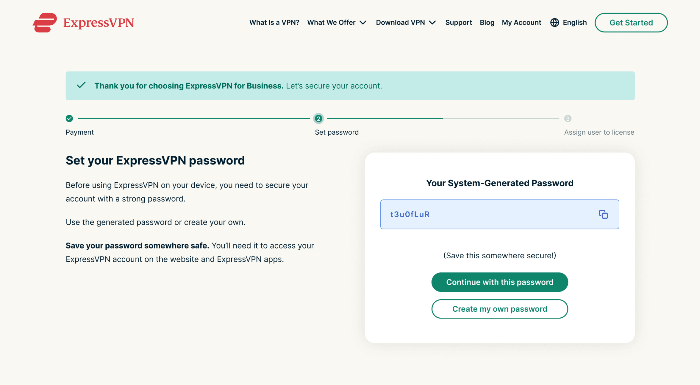
Post-purchase step lacked guidance
After purchasing, users landed on a subscription overview page with no password setup and no clear next step - and had to find a separate button to reach the License Manager, breaking the natural flow.
challenge #02
Clear license overview & management tools
Replaced the disconnected overview with a guided confirmation screen
Added a password creation step as a natural continuation of the flow.
Introduced a progress bar showing the current step and that the License Manager is next
A secondary 'View all plans' button was added for users who want to compare - but visually de-emphasized so it doesn't compete with the main CTA.
Users who do browse all plans are no longer the default path - the primary flow skips this step entirely
The option to view all plans remains available, ensuring users who need more information aren't left without a way to explore.
solution #02
The SOLUTION
A clearer, more direct path to the
promoted offer
challenge #01
Inconsistent message and flow
The page promoted the best plan, but the CTA routed users to a plans page - adding an unnecessary step right when they were ready to act
solution #01
Direct path to the best offer
The primary CTA now leads directly to the 12+3 checkout.
The copy, visual hierarchy, and CTA all reinforce the same message - making the promoted plan feel like the obvious choice.
challenge #01
Too many choices slowed decisions
Presenting all plans upfront pulled attention away from the promoted offer and made it harder for users to commit - creating friction at the most critical point in the flow.
solution #01
Direct path to the best offer
A secondary 'View all plans' button was added for users who want to compare - but visually de-emphasized so it doesn't compete with the main CTA.
Users who do browse all plans are no longer the default path - the primary flow skips this step entirely
The option to view all plans remains available, ensuring users who need more information aren't left without a way to explore.
The SOLUTION
A seamless flow from purchase to license management
Inconsistent message and flow
The page promoted the best plan, but the CTA routed users to a plans page - adding an unnecessary step right when they were ready to act
challenge #01
Direct path to the best offer
Restructured the purchase landing page with a clear hierarchy and logical flow.
Highlighted the best-value option to guide decision-making.
Added prominent call-to-action buttons to reduce hesitation.
The primary CTA now leads directly to the 12+3 checkout.
The copy, visual hierarchy, and CTA all reinforce the same message - making the promoted plan feel like the obvious choice.
The primary CTA now leads directly to the 12+3 checkout.
The copy, visual hierarchy, and CTA all reinforce the same message - making the promoted plan feel like the obvious choice.
solution #01
Disorganized license manager with low visibility
The License Manager didn't provide a clear overview of total, assigned, or remaining licenses. The interface was cluttered with buttons that created confusion, and missing tools like search, filters, and bulk actions made managing large teams slow and inefficient.
challenge #03
Clear license overview & management tools
Added a clear license overview - total, assigned, and remaining at a glance.
Introduced bulk actions for updating multiple users at once.
Added filtering, search, and CSV import for faster, more flexible management
Replaced scattered inline buttons with a contextual action menu per license row, reducing visual noise and making actions easier to find.
solution #03
The SOLUTION
A clearer, more direct path to the
promoted offer
Too many choices slowed decisions
Presenting all plans upfront pulled attention away from the promoted offer and made it harder for users to commit - creating friction at the most critical point in the flow.
challenge #02
Direct path to the best offer
Replaced the disconnected overview with a guided confirmation screen
Added a password creation step as a natural continuation of the flow.
Introduced a progress bar showing the current step and that the License Manager is next
A secondary 'View all plans' button was added for users who want to compare - but visually de-emphasized so it doesn't compete with the main CTA.
Users who do browse all plans are no longer the default path - the primary flow skips this step entirely
The option to view all plans remains available, ensuring users who need more information aren't left without a way to explore.
solution #02
Results
Clear improvements across all key metrics
The A/B test reached statistical significance after three weeks, confirming that aligning the message with the interaction had a direct impact on user behavior and conversion.
The results validated the core hypothesis - users don't need more options, they need clearer guidance. Removing friction and reinforcing the offer moved the needle across every metric.
+17% plan adoption rate
Highlighting the recommended plan and removing competing options made it the clear and easy choice.
+12% CTR
A direct CTA and stronger visual hierarchy drove more users to engage with the promoted offer.
+8% conversion rate
Clearer guidance and a frictionless path to checkout improved purchase completion across the board. Bounce rate also decreased, indicating users stayed longer and progressed further in the flow.
Clear improvements in clarity and efficiency
Clear improvements across all key metrics
The redesigned flow made it measurably easier for managers to purchase & manage VPN licenses - with a direct impact on conversion, engagement, and drop-off.
The results validated the core decision of the redesign - treating the experience as one continuous flow, rather than isolated screens, had a measurable impact across all key metrics.
The A/B test reached statistical significance after three weeks, confirming that aligning the message with the interaction had a direct impact on user behavior and conversion.
The results validated the core hypothesis - users don't need more options, they need clearer guidance. Removing friction and reinforcing the offer moved the needle across every metric.
results
+22% conversion rate
+17% plan adoption rate
The clearer, more structured purchase flow reduced confusion during checkout, resulting in a measurable increase in subscription conversions.
Highlighting the recommended plan and removing competing options made it the clear and easy choice.
+18% CTR
+12% CTR
Highlighted deals and clearer call-to-action buttons drove more users to engage with the purchase flow.
A direct CTA and stronger visual hierarchy drove more users to engage with the promoted offer.
-16% drop-off rate
+8% conversion rate
By removing friction and clarifying the end-to-end flow, fewer users abandoned the process before completing their purchase.
Clearer guidance and a frictionless path to checkout improved purchase completion across the board. Bounce rate also decreased, indicating users stayed longer and progressed further in the flow.
Improved user satisfaction
A clearer, more guided experience reduced confusion and support tickets - leaving managers with a flow that finally made sense.
High Drop-offs, low conversions & frustrated users
Strong offer, misleading flow - users were dropping off before they could convert
Two core problems were brought up - one business-side, one experience-side.
Surfaced through product analytics and support tickets, these became the foundation for the redesign. Both pointed to the same root cause: a fragmented experience with low clarity and missing tools.
An A/B test on the existing landing page revealed that users weren't converting as expected - even though the deal was genuinely compelling. Drop-off rates were high, and the promoted plan wasn't being chosen at the rate the business needed.
The data made one thing clear:
the problem wasn't the offer, It was the flow surrounding it.
Two core pain points made this clear:
The problem
Unclear purchase flow and value
The CTA didn't lead where the offer pointed
The purchase page didn't clearly show how to complete the purchase or what would happen next, and it didn't highlight the best-value option, so users didn't feel confident or motivated to buy.
The hero button was the most prominent action on the page - but instead of taking users directly to the best plan checkout, it routed them to a generic plans page. The momentum built by the offer was lost the moment users clicked.
#01
Post-purchase step lacked guidance
Too many choices slowed decisions
After purchasing, users landed on a subscription overview page - and had to find a separate button to reach the License Manager, breaking the natural next step.
Presenting all plans upfront introduced decision fatigue - pulling users' attention away from the promoted plan and making it harder to commit.
#02
Disorganized license manager with low visibility
The License Manager didn't provide a clear overview of total, assigned, or remaining licenses. Missing tools like search, filters, and bulk actions made managing large teams slow and inefficient.
#03